One of the largest florist collectives in the world, FTD, is bringing its 111 years of expertise in floral gifting and delivery to the forefront with a full creative rebrand. Announced on September 30th, 2021, the new branding will not completely do away with the old. Rather, it will provide a refreshed look that not only remains true to FTD's rich legacy, but also resonates with its customers and partner florists.
Working closely with branding agency, Base Design, the rebranding was led by FTD's Chief Creative Officer, Annelies De Rouck. ProFlowers, a subsidiary of FTD, will also begin to roll out brand updates done in partnership with RoAndCo creative studio.
In an interview with Base Design about the rebranding, Annelies De Rouck explains, "...our goal is to transition from a standardized, commoditized look, feel, and experience, to inhabit this positioning of being a heritage brand that offers handcrafted products and supports small businesses. We saw incredibly fertile territory to explore creatively, and we are so excited to bring this to life."
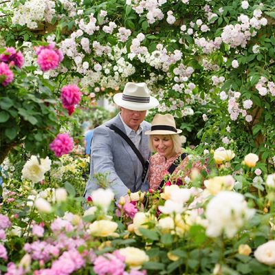
To guide the creative process and art direction, Base Design tapped into the human emotions and behaviors associated with meaningful giving. With a focus on "flower power" and an understanding of what flower gifting means in today's landscape, the agency designed branding elements to help build a fresh narrative surrounding FTD's century-long story, as well as the beautiful flowers and local businesses behind it. And what better protagonist to assist with this storytelling than FTD's official flower deliverer—the Mercury Man®.
Arguably, one of the most recognizable updates to come from this rebranding is the new logo. Base Design took FTD's already iconic emblem—a silhouette of Mercury, the Roman god of commerce and messages—and incorporated the slightest tweaks, such as the company's founding year. Proving that even minor adjustments can still make a big impact, this sleeker and more elevated version of the Mercury Man® logo "immediately gives the brand a cachet," as De Rouck notes.
Similarly, the use of olive green as the dominant color in the rebrand’s palette is another refreshing addition to FTD's reinvented look. This elegant color shines well on its own, but also serves as a complementary (and incredibly fitting) backdrop to highlight the flower arrangements promoted across FTD's touchpoints.
Alongside the logo, FTD will release other innovative changes in phases over the upcoming months, including updated packaging, a revamped website and partner florist platform, and more refined product offerings. These key initiatives are aimed at modernizing and streamlining services to make gifting experiences easier and better for users.
–
For a related video on this developing story, please click here or visit www.ftd.com.